|
EZIPOP cardboard brochure holders are the green way to display brochures, leaflets and products at P.O.P.
Our patented products provide on counter advertising information at point of sale that’s easy to use, easy on the environment and easy on your budget. They advertise your message, and information right where your customers make their final purchase decision and make a subtle statement about your organisation’s committment to a greener, smarter world. |
|
|
related links
|
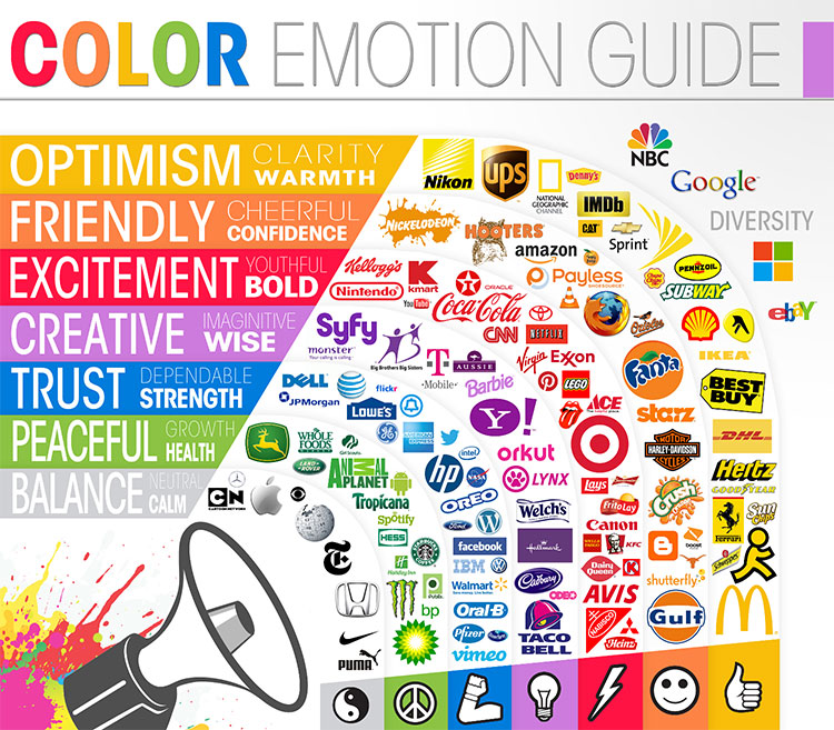
Blog[ Go back ] The Power of One (Colour)Much has been researched and written about the psychological impact of colour but what about the practical aspects of using one colour in your point of purchase items, such as EZIPOP cardboard brochure holders.
Take a look at this Color Emotion Guide at right, produced by The Logo Company.
Apart from how different colours might make us feel or act, see how many major companies feature one colour in their logo.
Remember when Apple began? They had a rainbow striped apple symbol and now it’s just shades of grey. Looking at the logos featured in this chart, I think we'd agree theres some major brands using just one colour for their corporate logo and with great success.
Colours can mean different things in different cultures too, for example white can symbolise death in some eastern cultures, whereas in western cultures it’s black. There’s some good info on colour symbolism and culture via this link.
However, let's focus here on using one colour in P.O.P. products like our EZIPOP brochure holders.
In a world of colour it’s amazing how black & white photographs now stand out and have become a favourite in photo exhibitions. So consider this, when your brochures are displayed in store, on counter etc., they’re usually surrounded by a myriad of colour and clutter.
That’s when it can be a good idea to stick with one colour to stand out from the rest. If your own identity or logo is one colour, it may work well to reinforce that by using it as a solid colour on your EZIPOP brochure holder.
We’ve seen it too, where the brochures are such a mix of colours that the most effective way to display them is by keeping the EZIPOP brochure holder basically white, with just the logo or call to action in black.
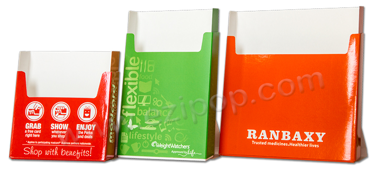
The benefits of one colour include cost savings. There’s a saving in pre-press costs using one colour instead of four. There’s also savings to be made during the print process because of the quicker set-up times and run speed. The savings in total can be very worthwhile and when you look at the 3 examples above where Madcard used just red, WeightWatchers used green and Ranbaxy solid orange, they haven’t sacrificed anything in visual impact, in fact they have gained impact and reinforced their brand identity.
If you would like more information on one colour pricing, ask us for a quote here.
If you would like to comment or ask any questions regarding this post, contact us here.
|